Welcome to the MNA Foundation Design System. This system is a comprehensive VanillaJS and SCSS library designed to be a flexible and token-based foundation for building consistent, high-quality user interfaces with clean architecture principles.
Installation
Install the design system packages from npm. You can install individual packages or all of them:
Think flexibility: Can this be reused in another layout?
13. Design Optimization Guidelines
Typography Optimization: Limit font families and weights — use only what's defined in the design system to reduce load time
Text Styles: Avoid unnecessary text styles (e.g. random bold/italic combinations)
Image Assets: Compress and optimize image assets before uploading to Figma
Compression Tools: Use plugins like TinyPNG or Figma tools like Image Palette Cleaner to reduce asset file sizes
Vector Graphics: Use vector shapes or SVGs instead of large raster images whenever possible
Opacity Management: Use opacity tokens or tints (lightened color values) instead of setting arbitrary opacities manually
Opacity Best Practices: Avoid using 50% opacity on text or backgrounds — instead define and reuse semantically meaningful tints (e.g. --primary-500-tint-50)
File Cleanup: Remove hidden layers, unused artboards, and off-canvas content to reduce file bloat
Color Consistency: Stick to the defined color palette — avoid introducing undocumented brand colors
Component Usage: Use components instead of detached instances to avoid duplication and maintain consistency
Responsive Design: Use layout grids and constraints to simulate responsive behavior in design
Mobile Testing: Preview mobile breakpoints to ensure spacing, legibility, and interaction patterns hold
Regular Audits: Regularly audit your Figma files for unused styles and local overrides
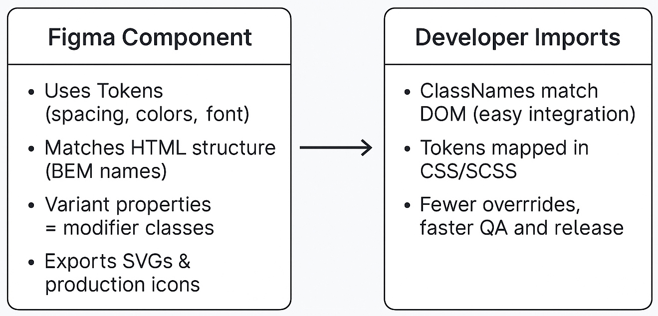
14. Developer Handoffs — Production-Ready Assets
Exportable Assets: Ensure all assets are properly set up for export with clear naming conventions
Proper Sizing: Define standard sizes (1x, 2x, 3x) for different device densities when needed
Batch Export: Use batch export (Shift + Command + E) rather than exporting assets one at a time
Export Settings: Configure consistent export settings for each asset type (SVG for icons, PNG/JPG for images)
Asset Organization: Group related assets in frames with clear naming for easy batch selection
Documentation: Include asset specifications in design handoff notes (dimensions, formats, use cases)
Version Control: Use descriptive frame names that indicate asset versions or states
Accessibility: Ensure exported assets include proper alt text descriptions for developers
File Structure: Organize exports in folders that match the intended file structure for development
Quality Assurance: Review exported assets at actual size to ensure they meet quality standards
Responsive Assets: Provide multiple sizes for assets that need to scale across different screen sizes
Format Guidelines: Use SVG for icons and simple graphics, PNG for images with transparency, JPG for photographs
Naming Consistency: Follow the established naming convention (kebab-case) for all exported files
Asset Inventory: Maintain a clear list of all exported assets with their intended usage
📋 Pre-Handoff Checklist
✅ All assets are properly named and organized
✅ Export settings are configured for each asset type
✅ Batch export is tested and working
✅ Assets are reviewed at actual size
✅ Documentation includes asset specifications
✅ File structure matches development requirements
✅ No hidden or unused assets are included
✅ All assets follow the design system's naming conventions
Design Tokens
Design tokens are the core of the system, stored as CSS variables. They control all fundamental visual styles to ensure brand consistency.
Colors
Spacing
Typography
Border Radius
Primary
--primary-50
--primary-100
--primary-200
--primary-300
--primary-400
--primary-500
--primary-600
--primary-700
--primary-800
--primary-900
Secondary
--secondary-50
--secondary-100
--secondary-200
--secondary-300
--secondary-400
--secondary-500
--secondary-600
--secondary-700
--secondary-800
--secondary-900
Semantic
--success
--warning
--error
--info
Spacing Scale
Spacing tokens follow a base-4 system for consistent spacing across the design system.
--spacing-1 (4px)
--spacing-2 (8px)
--spacing-3 (12px)
--spacing-4 (16px)
--spacing-5 (20px)
--spacing-6 (24px)
--spacing-7 (28px)
--spacing-8 (32px)
--spacing-9 (36px)
--spacing-10 (40px)
--spacing-11 (44px)
--spacing-12 (48px)
--spacing-14 (56px)
--spacing-16 (64px)
--spacing-20 (80px)
--spacing-24 (96px)
--spacing-28 (112px)
--spacing-32 (128px)
Spacing Utility Classes
Use these utility classes for quick spacing adjustments. They follow the same scale as the design tokens.
Naming Convention:
p = padding, m = margin
t = top, r = right, b = bottom, l = left
x = horizontal (left + right), y = vertical (top + bottom)
no prefix = all sides (e.g., .p-4 = padding on all sides)
The Navigation component provides a responsive, accessible, and token-driven navigation bar with optional utility and main navs, dropdowns, and a fixed/sticky option. All spacing, color, and typography use design tokens.
Note: Both <a> and <button> elements use .navigation__link for consistent height and padding. The navigation uses data-component="Navigation" for design system alignment. Hamburger and close buttons are included for mobile menu toggling.
Container
The Container component provides a consistent wrapper for content with responsive max-width and centered alignment. It ensures content doesn't become too wide on large screens while maintaining proper spacing and readability across all device sizes.
Preview
Code
This is a container.
<div class="container">...</div>
Grid
The Grid component provides a flexible, responsive layout system based on CSS Grid. It supports multiple columns, gaps, spans, and alignment utilities, making it easy to create complex layouts that adapt to any screen size.
Preview
Code
Basic 3-Column Grid
Grid
Preview
Code
Basic 3-Column Grid
1
2
3
12-Column Grid with Spans
Span 6
Span 3
Span 3
Span 4
Span 4
Span 4
Grid with Offsets
Offset 2, Span 4
Offset 8, Span 3
Grid Structure Visualization
1
2
3
4
5
6
7
8
9
10
11
12
Above: 12-column grid structure. Below: Items positioned with offsets.
The Card component is a flexible content container used to group related information. It follows BEM (Block Element Modifier) conventions and supports various visual styles through modifiers and design tokens.
Preview
Code
Standard Card
Card with Shadow
This is a standard card with a shadow, header, and body content.
Card with Image
Card with an Image
This card features a prominent image at the top, perfect for articles or product showcases.
Bordered Card
Bordered Card
This card has a subtle border instead of a shadow.
Horizontal Card
Horizontal Layout
This card uses a horizontal layout, suitable for item lists or summaries.
The Button component provides accessible, interactive triggers for user actions. It supports multiple variants, sizes, and states, and is fully customizable using design tokens and modifier classes.
The Accordion component allows users to expand and collapse sections of content. It is ideal for FAQs, menus, and any scenario where content needs to be revealed progressively.
The Tabs component organizes content into multiple panels, allowing users to switch between them without leaving the page. It is keyboard accessible and supports dynamic content.
The Video Player component provides a responsive video player with auto-initialization. It supports local, Vimeo, and YouTube videos. Just add .video-player and data-video-url to your element.
The Rive Animation component wraps the official Rive Web JS runtime, providing a design system-aligned interface for embedding interactive animations. It supports all Rive parameters and APIs with markup-driven configuration.